A digital approach to cooking
How we designed a cloud platform to help catering kitchens build recipes and cook smarter.
Role
Design and Team Lead at Ecreo
Contribution
User Research, Product Strategy, Wireframes, Prototyping, Product Design and Design Systems.
A shared vision
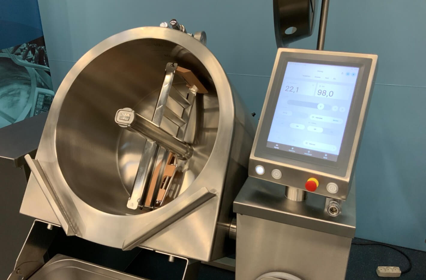
The Danish-based manufacturer JØNI has been producing equipment for the catering industry since 1973, and in 2017 they proceeded with the vision of digitizing their titling kettles.
I was part of an ambitious project with my colleagues at Ecreo to reimagine the cooking experience for catering kitchens across the world.
The platform launched February 2020.
The challenge
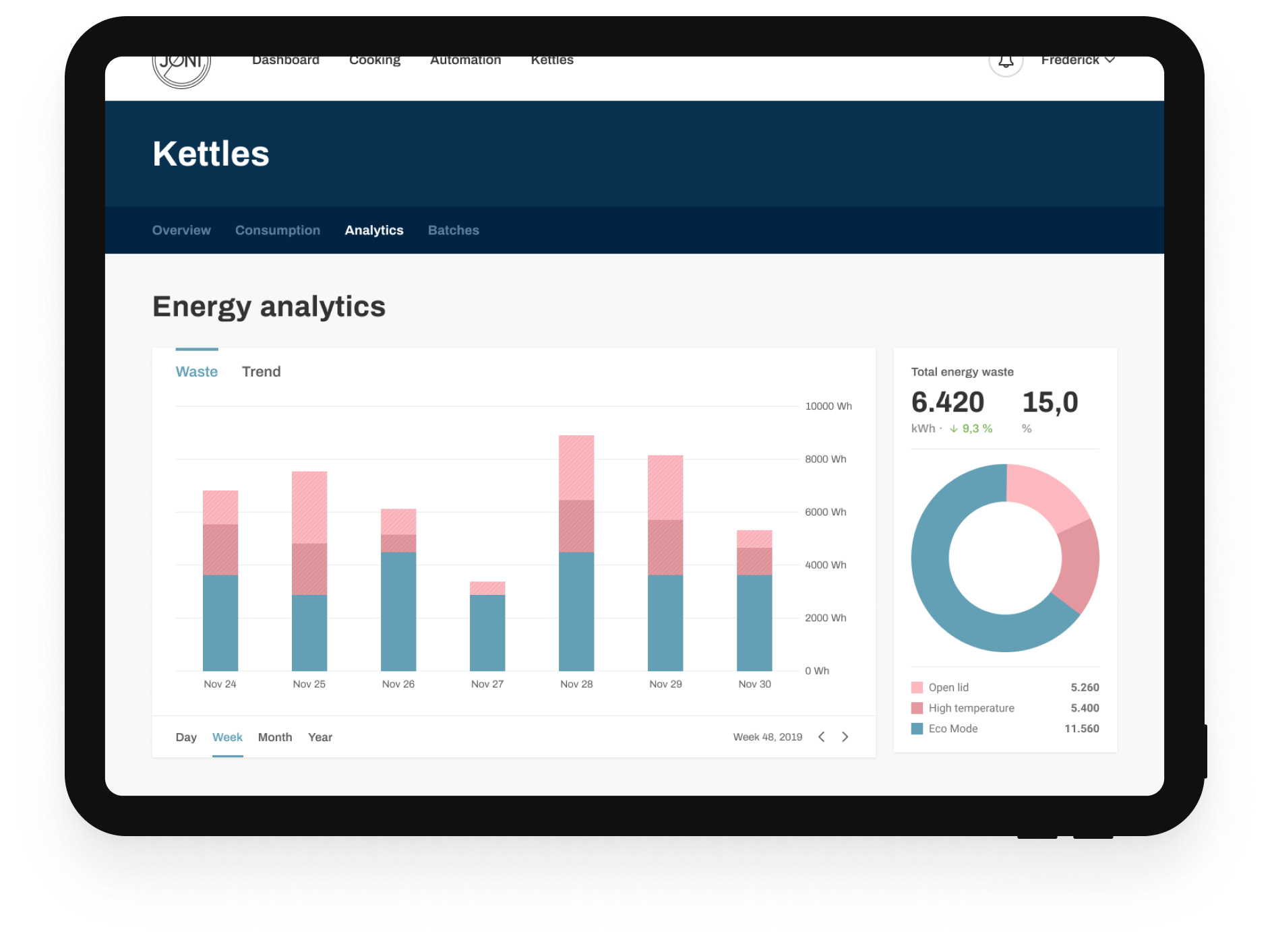
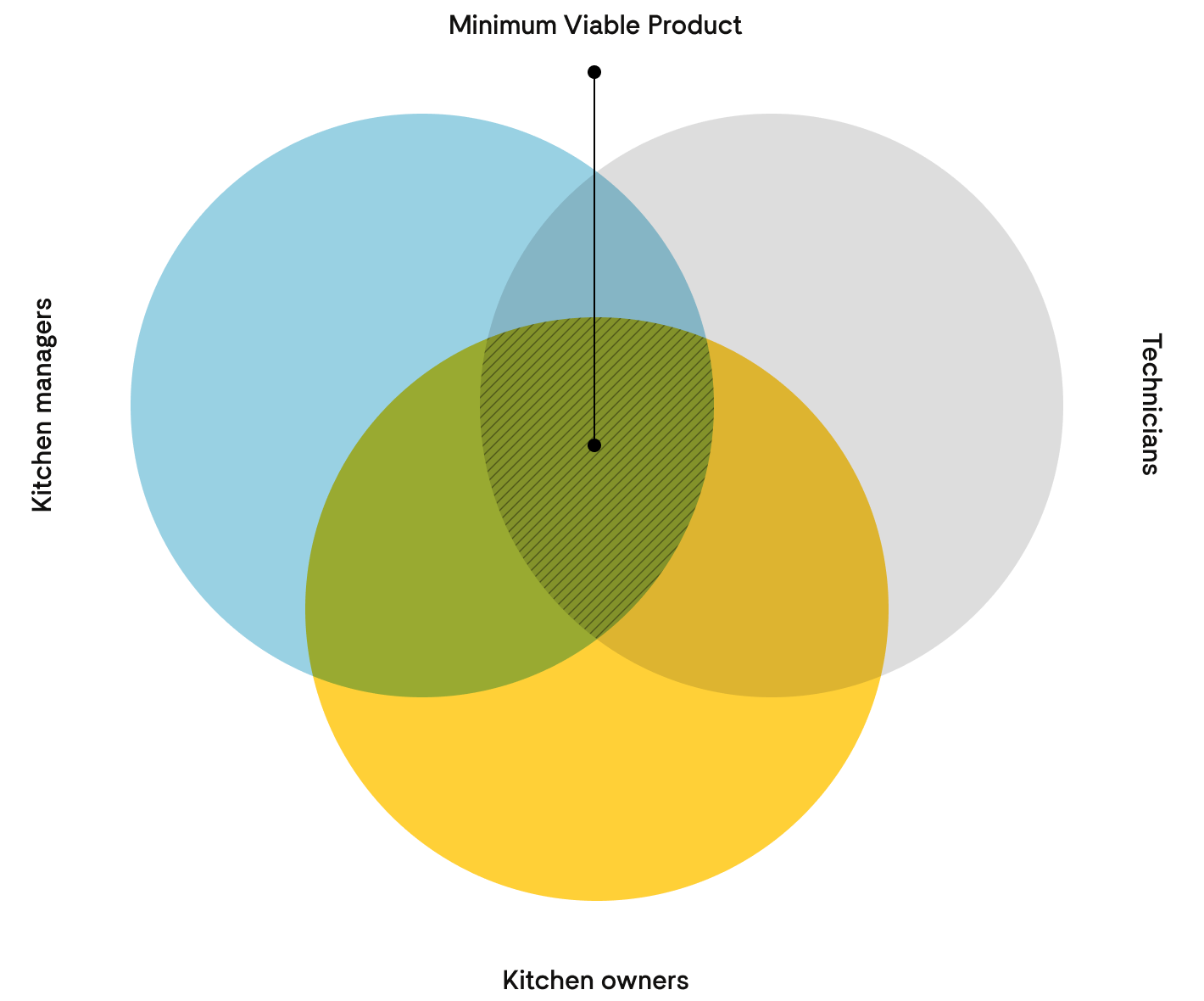
We needed to build a modish platform to accompany the smart kettle. An effortless user experience with just enough capability to support our three primary user groups.
Kitchen managers should be able to craft recipes and cookbooks for their staff to use on the kettle.
Technicians should be able to perform maintenance and access critical service features.
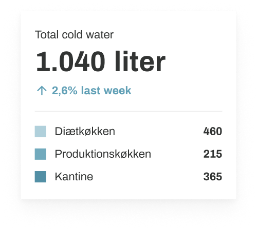
Kitchen owners should be empowered to improve efficiency and lower emission in their kitchens.
In order to ensure sufficient features to satisfy early adopters, we modelled our approach after the development technique Minimum Viable Product (MVP).
My role
As with the kettle Coming soon, I led the product design proces. I was responsible for researching, building the architecture, prototyping, interaction design, usability testing and creating a dynamic, design system.
Besides me our team consisted of a Solution Architect, a backend developer and three frontend developers. We worked closely together with JØNI’s Product Manager and their CEO.
All work was done internally.
Our approach
We initially specified the requirements for the application and mapped out the multiple user journeys across a few collaborative sessions.
I then preceeded with transforming the user journeys into a low fidelity prototype to help visualize the structure.
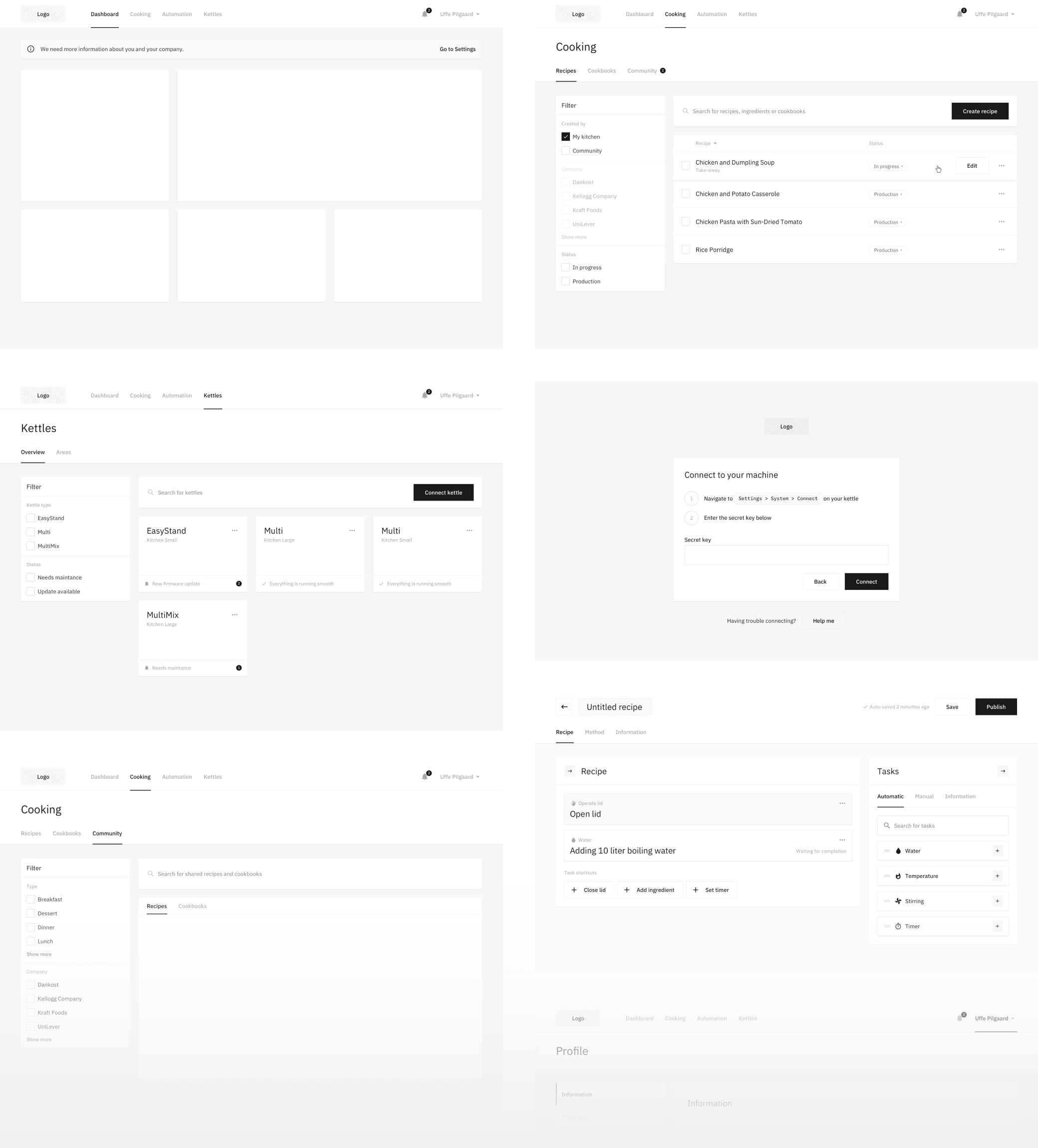
... we could much quicker decide upon and define the core functionality
This approach was especially useful, because we could much quicker decide upon and scope the core functionality of the Minimium Viable Product.
This also meant our architect could lay the ground work for many of the complex integrations much sooner than expected.
We moved onto designing each component as high fidelity wireframes based on previous specs, and once the prototype resembled our vision, we started talking visuals.
The visuals
The exploration of familiar patterns.
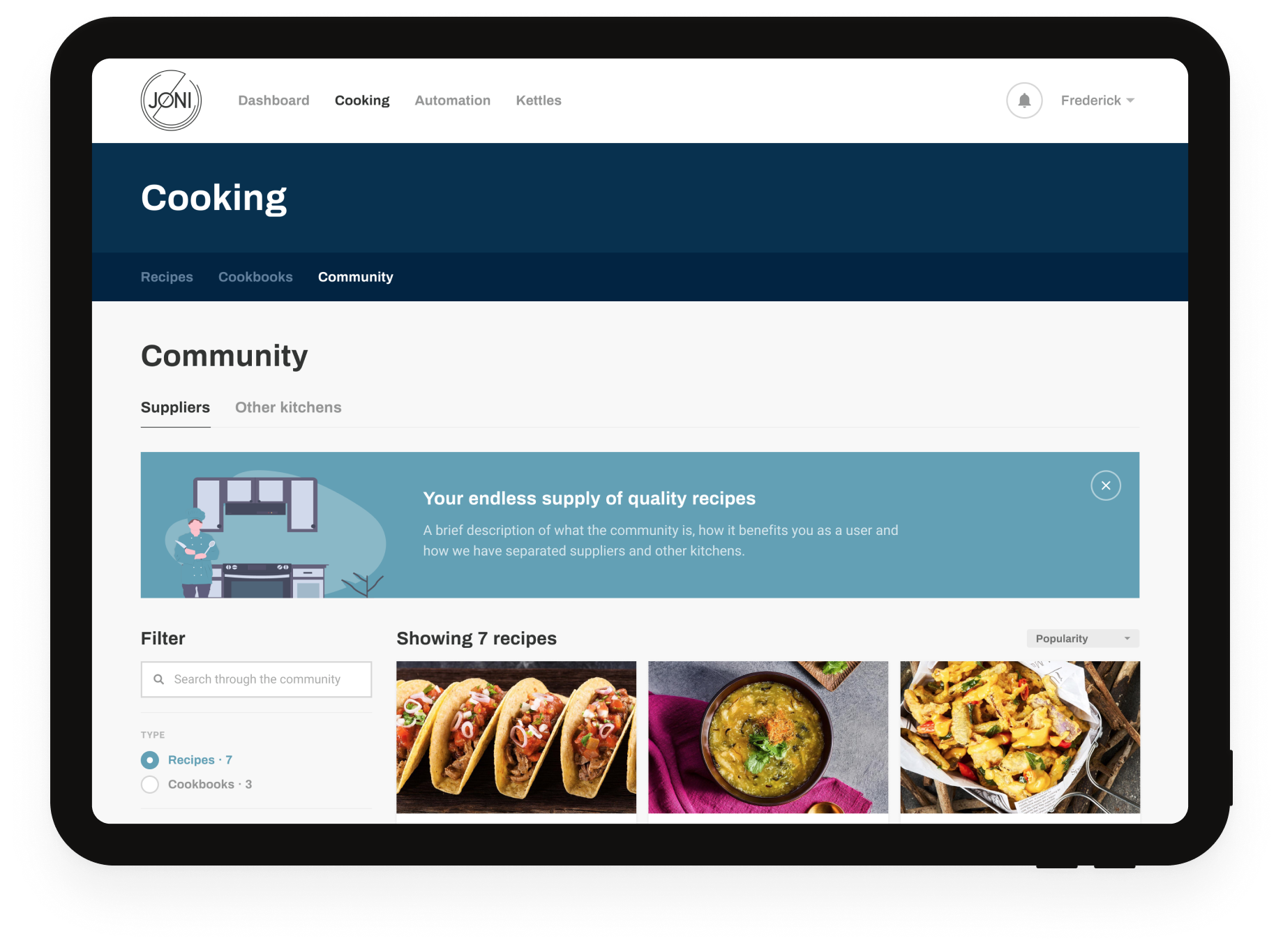
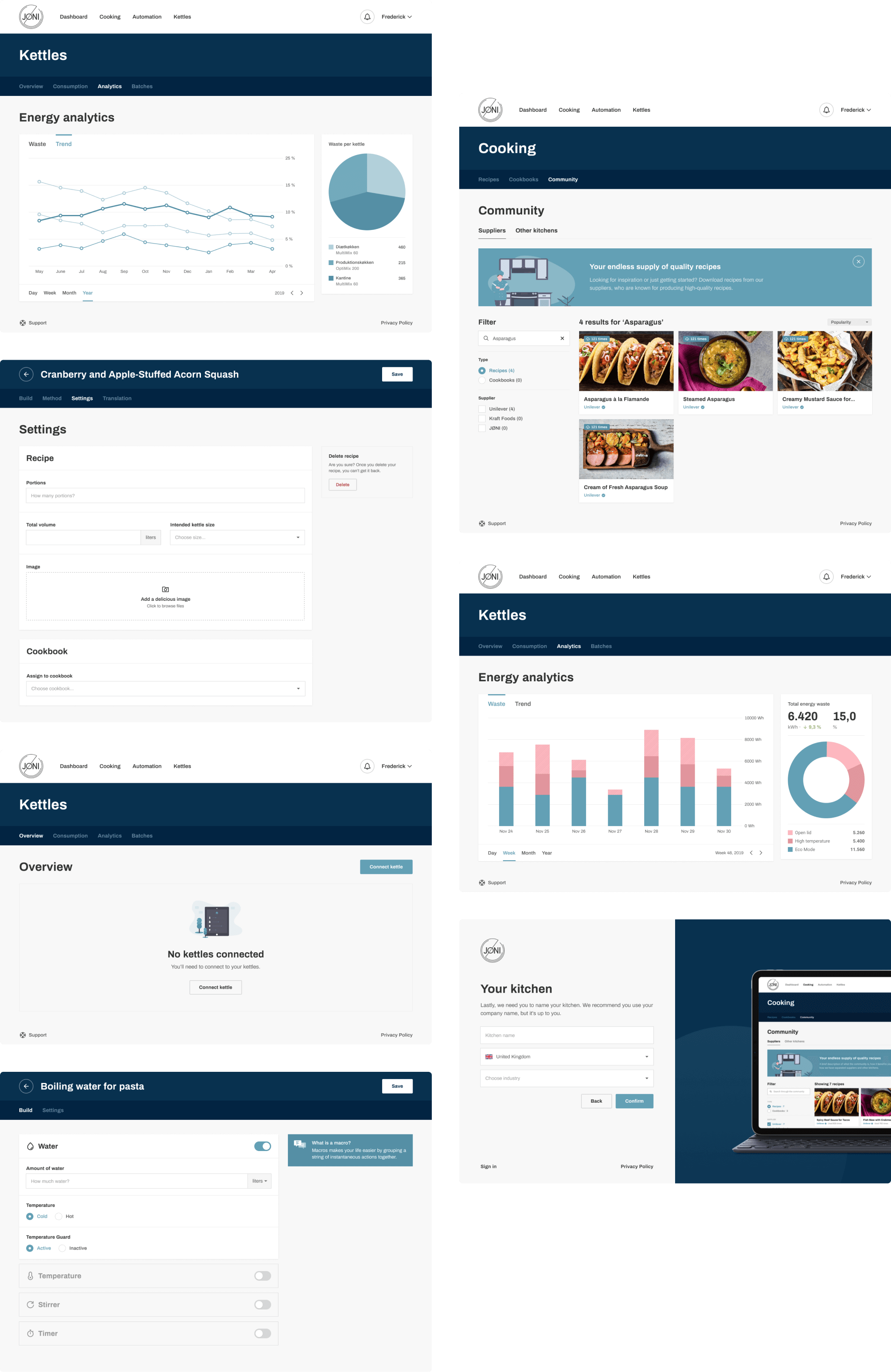
The majority of our visual design work centered around crafting a familiar and delightful experience for our novice users.
Our design direction was based on earlier market research. We concluded software visuals in these industries are typically dull and deprived of personality.
Designing an interface with personality became important to us. Our color palette and tone of voice helps, but the illustrations designed and open-sourced by Katerina Limpitsouni helped us reach another level.
Enabling cooks to work smarter and faster
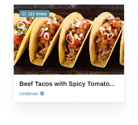
A key feature is the automated recipes. These recipes are built on the platform and sent to the kettles where kitchen staffers cook the recipes.
We created an easy-to-use visual editor that allows both technical and non-technical users to build recipes to accommodate the needs of their daily cooking routines.
Design consistensy across teams
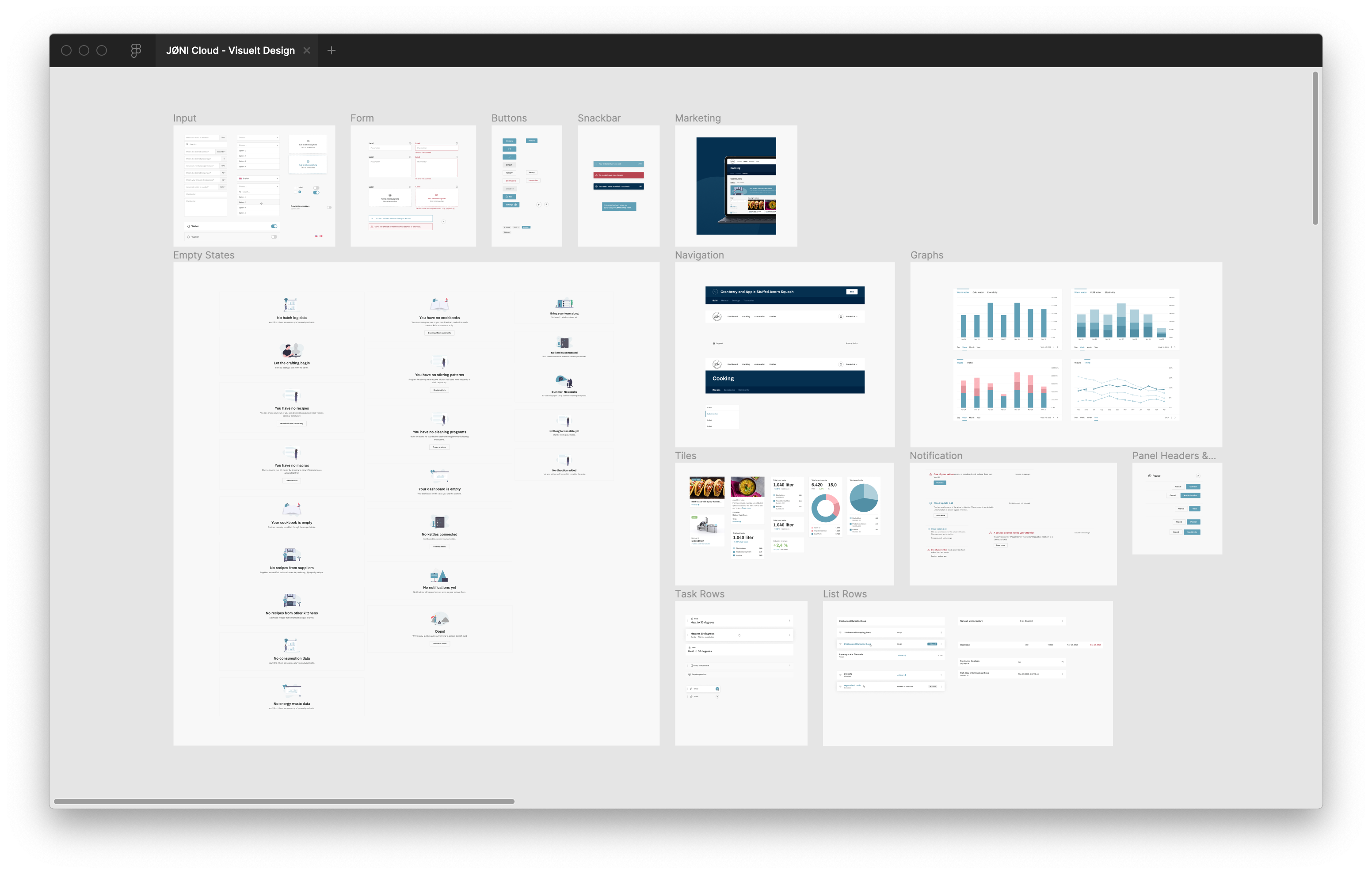
In order to keep the platform consistent and cohesive we designed and built a living style guide in Figma that allowed our designers and developers to have a common reference to use while creating new interfaces.
Conclusion
I'd like to thank our wonderful team at Ecreo; whether you designed the underlying architecture, developed the snackbar component or did code reviews. Every teammate was essential in getting this platform off the ground.
I'd also like to show my appreciation for the stakeholders. Especially Uffe and Lars for powering through this process. I've enjoyed their grit and prowess in countless meetings.
Thanks for reading,
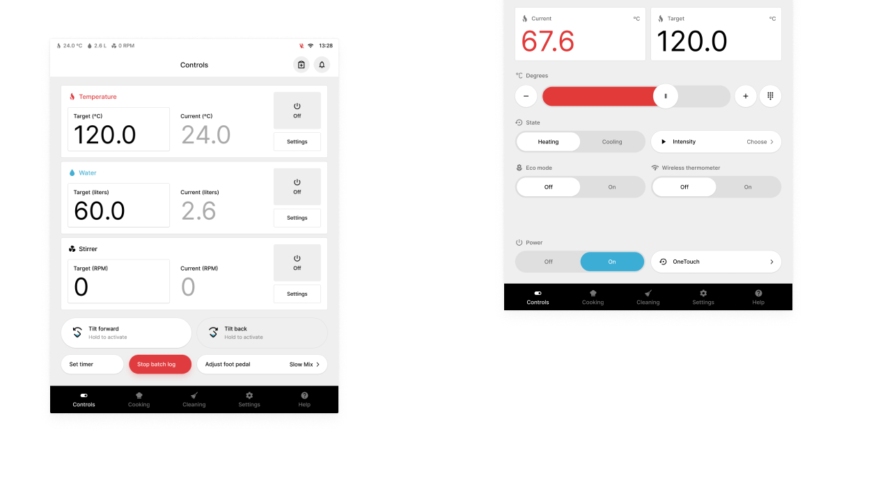
When smart hardware meet software
Role
Design Lead
Contribution
User Research, Wireframes, Prototyping, Product Design and Design Systems
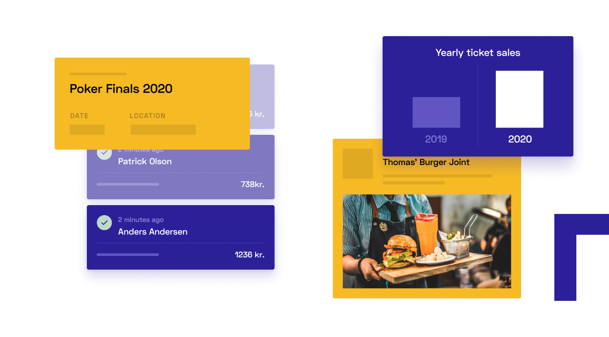
A website builder based on open-source
Role
Product Manager and Designer
Contribution
Product Strategy, Technical Architecture, Prototyping, Brand Identity and Product Design
